
Transforming Energia’s digital customer experience
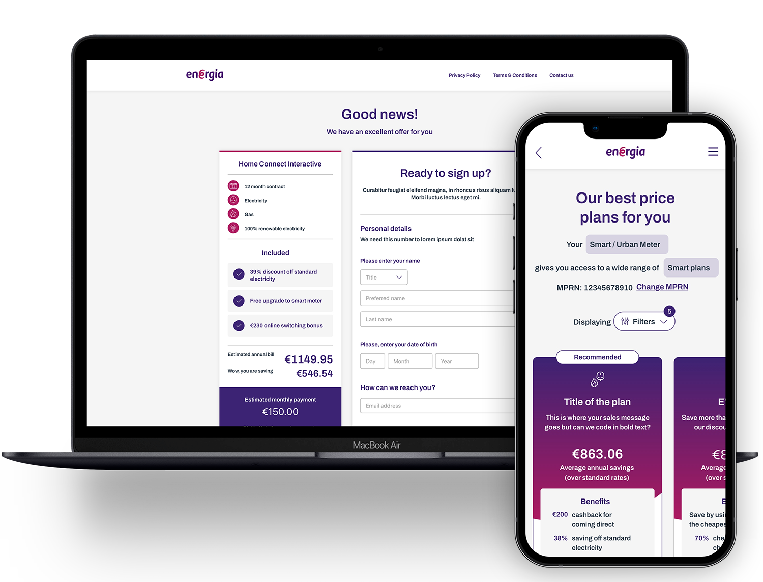
Led the design for a large CX transformation project. First establishing an industry-leading customer acquisition site, with a focus on findability and understanding of complex energy tariffs and simple sign-up as well as the redesign of two mobile apps bringing self-service to the customer cutting Call Centre volumes, moving customers to direct debit, and providing simplified understanding of tariffs and bills.
Energia, once a low-cost challenger in the Irish energy market, wanted to invest in longer-term, value-oriented customer relationships as it matured as a business. I led Experience and Service Design for Accenture on a large multi-strand customer experience and data transformation programme, covering data replatforming, data science and a full redesign of the digital customer experience. Phase one focused on two connected workstreams: a redesigned website covering plan selection, sign-up and new brand implementation and a companion mobile app redesign, built as a shared design system across both Energia in the Republic of Ireland and its Northern Irish counterpart, Power NI.
Energia’s digital experience was working against the exact relationship it was trying to build:
- The sign-up journey asked for complex, personal information too early - including things like a last meter reading, which is impossible to provide if you haven’t moved into the property yet. This caused avoidable drop-offs, each one either a lost customer or one who ended up calling the call centre instead
- Plan selection was just a long, undifferentiated list of tens of plans to compare unaided, common across the industry (one provider had 100 separate plans), effectively an impossible choice
- The mobile experience was fragmented - Energia and Power NI were running three inconsistent apps between them, none with proper self-service for basics like saving payment methods or managing direct debits and one brand required two separate apps just to manage usage and payments
- Account balance was confusing and disconnected - tied to bill dates and smoothed payment plans and shown separately for gas and electricity with no unified view of usage or spend
- Irish incumbents, Energia included, lagged behind more customer-experience-focused providers elsewhere - a clear gap and a clear opportunity, as Energia shifted toward being a customer-value provider
- Rising smart metering and EV ownership made tariffs more complex, not less - multi-timezone, advanced and EV-charging tariffs meant the cheapest-looking rate often wasn’t the cheapest plan for someone’s actual usage and there was no way to communicate that clearly
- Maintaining three inconsistent apps was an ongoing cost and experience risk - consolidating to one shared app and architecture was a direct, quantifiable saving
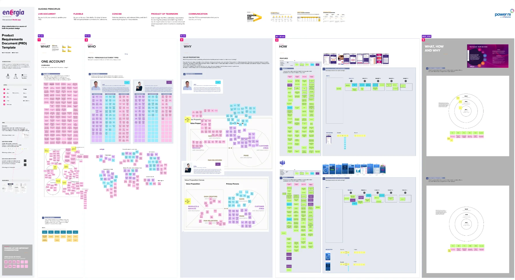
This was a large-scale Accenture transformation delivered across Ireland, the UK and India — the kind of behemoth engagement with a huge team and a lot at stake. I’d actually helped sell the project before I was staffed onto it, presenting in the sales pitch on why experience matters for energy providers globally, which meant the client already knew me by name and face by the time I landed. But the staffing and delivery plan that had been sold weren’t right, so before any design work could start, I had to redesign how the project would actually be delivered: a new plan, new deliverables and a new team structure, all approved and onboarded from scratch.
Once underway, I
- Led the redesign of the website’s sign-up and plan-selection journeys, moving from a single complex form to a staged, reassuring flow, informed by best-practice research and behavioural analysis of each step
- Directed the new step-by-step tariff selection wizard, replacing the undifferentiated plan list and led the new brand’s implementation across the site
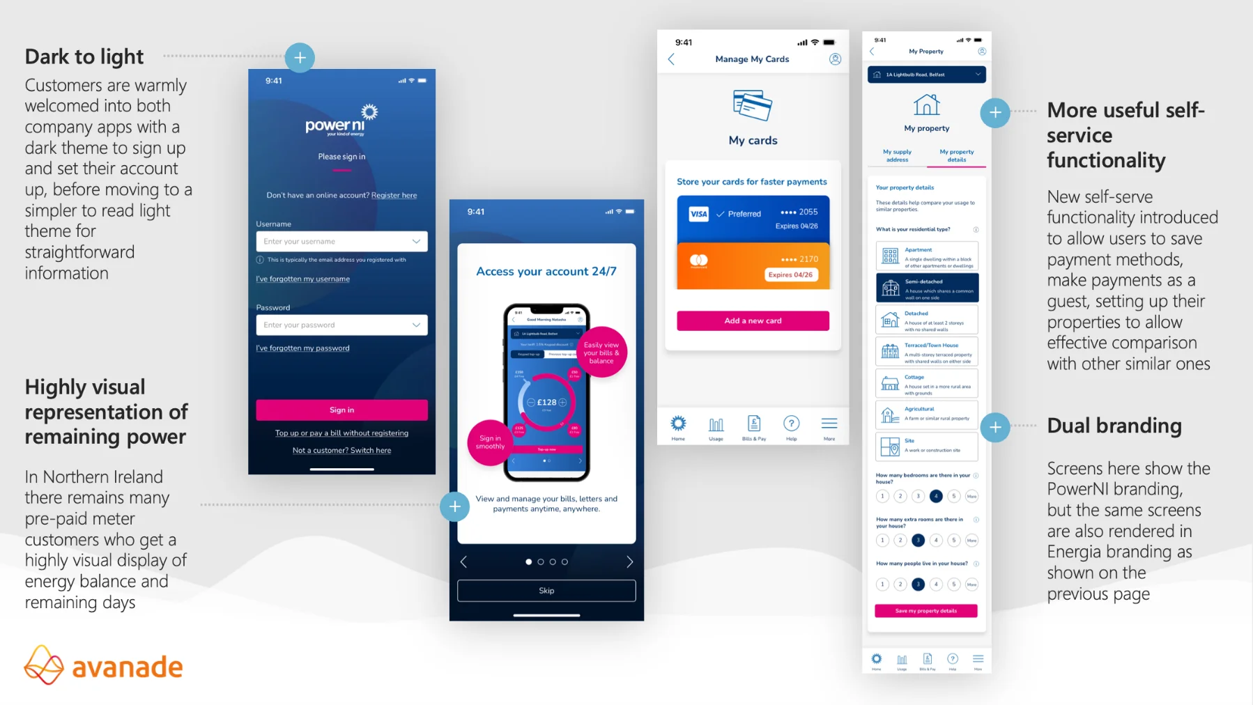
- Led the mobile app design, defining a shared design system used across both the Energia and Power NI apps - the first time either brand had standardised branding and build while still letting each carry its own visual identity (a light theme for Energia, dark for Power NI, on identical components and interaction models)
- Built in market-specific functionality, smart meters in the Republic of Ireland, Bluetooth-enabled prepayment meters in Northern Ireland, while keeping roughly 70% of the app common across both markets
- Introduced service design as a discipline the client had never really used — mapping the customer lifecycle to find the moments most likely to drive churn, rather than designing screens in isolation. It was genuinely new to them and it surfaced points in the journey where they were simply missing opportunities to keep a customer engaged, with no attempt made to save them from leaving
We were also part of a properly Scaled Agile delivery, planning sprints after every set of delivery sprints, heavy reporting and estimation processes, while simultaneously coaching the client through agile ways of working they hadn’t used before.
Discover
We benchmarked home energy provider apps and websites globally to establish current best practice - how providers communicated the impact of newly rolled-out smart metering, how they built trust and simplified sign-up and how they helped customers actually understand their tariffs. This confirmed that Irish incumbents, Energia included, lagged behind more customer-experience-led providers elsewhere, which gave Energia a clear opening to differentiate on experience rather than only price. For the mobile app specifically, we mapped the customer lifecycle through a service design lens to find the moments most likely to cause concern or frustration, rather than starting from a features list.
Design
The website’s sign-up journey was restructured into distinct, welcoming stages, easing customers into providing details rather than demanding everything up front - paced and reassuring, with clear progress and encouragement throughout. Plan selection became a step-by-step wizard matching customers to the right plan for their circumstances, with clearer explanations of what actually differentiated one plan from another.
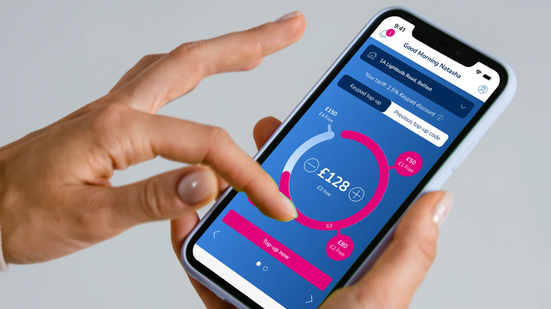
For the mobile apps, we designed a shared component and brand system carrying across both Energia and Power NI — around 70% common functionality, letting each market keep its own brand identity without duplicating design or build effort. We consolidated separate gas and electricity views into one combined view and simplified how billing balance was presented so usage and balance information sat together, closer to how customers actually read their statements. We spent significant time with subject matter experts on the language itself, making sure customers understood that a positive summer balance doesn’t mean they’re overpaying and a negative winter balance isn’t a problem, because it balances out over the year, so bills read as explanation rather than a constant demand for money. We also added real self-service functionality: saved payment methods, guest payments, direct debit management and property/landlord tools for managing multiple properties - all aimed at resolving needs in-app rather than by phone.
Deliver
We delivered the redesigned website; sign-up, plan selection and the new brand implementation, positioning Energia to roll out smart metering and advanced tariffs with a much clearer customer-facing story. We then delivered two mobile apps, for Energia and Power NI, built on Energia’s first shared design system, replacing three previously inconsistent apps with one consistent, maintainable design and build foundation across both brands.
The staged sign-up journey removed the friction that had been causing avoidable drop-off and the guided wizard replaced an undifferentiated plan list with a confidence-building path toward smart-metering-enabled tariffs. For the first time, Energia had a consistent brand across every digital touchpoint - website and both mobile apps.
On mobile, Energia now has a single shared design system standardising branding and build across both brands, consolidating three inconsistent apps into one, with a clear business case behind the reduced long-term cost of maintaining a single app instead of several. The combined gas-and-electricity billing view and the simplified presentation of account balance, made a genuinely complex concept understandable at a glance. New self-service functionality; saved cards, guest payments, direct debit management, multi-property landlord tools, was built specifically to shift resolution away from the call centre and into the app. Alongside the core scope, we prototyped early usage-analytics trending and comparison that put genuinely powerful insight into a simple interface; that’s now backlogged as future functionality.
One design detail worth calling out: on the website, we designed a way for customers to sign up “in principle” before they’d even set foot in a new property - booking their supply start date for the day they move in, with the actual meter reading added afterwards, either through the form or a quick call. Asking someone to switch energy provider on day one of moving house is a genuinely significant ask; this let Energia’s customers to do all the groundwork in advance, so the customer’s part of the job, on the day it actually matters to them, is as small as possible.
Karen Malone, Digital Product Owner for the Energia and Power NI applications, put it simply:
“Can’t believe we got everything completed. What fantastic work from you guys! It has been a pleasure.”
Looking back, what ties the website and app workstreams together is that they solved the same underlying problem at different moments in the customer relationship: complexity was being presented too bluntly, too early, without enough support for customers to make a confident decision. On the website, that meant resequencing the sign-up journey and building in trust before asking the hard questions, including letting people commit to Energia before they had answers they genuinely couldn’t give yet, like a meter reading for a home they hadn’t moved into. On the apps, it meant taking something customers found confusing, the account balance under a smoothed payment plan, and presenting it as one calm, coherent view rather than leaving customers to reconcile it themselves.
The broader lesson is that good customer experience work in a technically complex industry like energy isn’t about hiding the complexity, it’s about sequencing it, providing the right support, building trust and only ever asking customers to absorb one hard idea at a time. Customers will engage with self-service, but only if you make it genuinely simple.